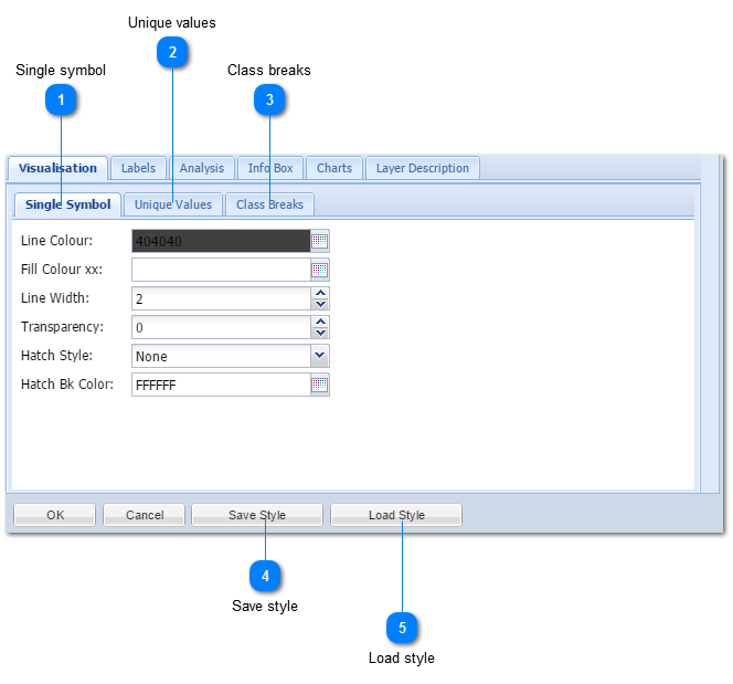
|
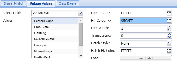
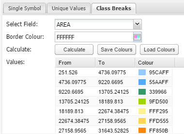
Select field
The user need to select a field in the attribute table where the unique values reside. Click on the dropdown box to choose.
Values:
The list of unique values will be displayed in the list box after the field was selected.
Line colour
The line colour refers to the outline of polygons. Click on the  button to get colour options or type in any HEX color code of choice
Fill colour:
The fill colour is the colour of the body of the polygon. Click on the button to get colour options or type in any HEX color code of choice
Line width:
The outline width can be set by using the arrows  .
Transparency:
The Transparency can be set from 0 to 255 of which 0 = No Transparency
Hatch style:
MapAble offers the user a range of Hatching styles. Click on the dropdown button to view all styles.
Hatch background colour:
The hatching color can be set here. Click on the button to get colour options or type in any HEX color code of choice
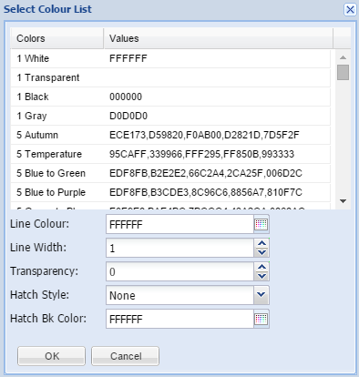
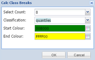
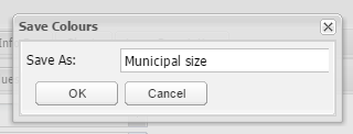
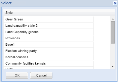
Load Palette:
Predefined colour palettes can be loaded from here to automatically do the colours of all the unique values. The user click on the Load Palette button to open a list box to choose from:
From here the outline can also be customised.
|
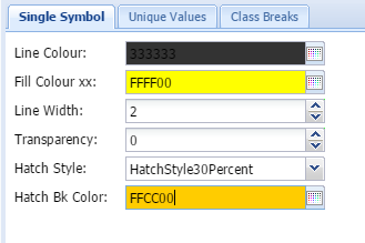
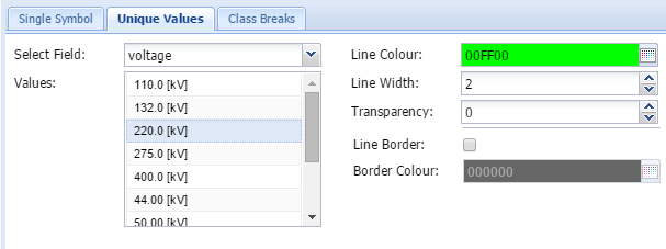
Select field
The user need to select a field in the attribute table where the unique values reside. Click on the dropdown box to choose.
Values:
The list of unique values will be displayed in the list box after the field was selected.
Line colour
Click on the button to get colour options or type in any HEX color code of choice
Line width:
The line width can be set by using the arrows .
Transparency:
The Transparency can be set from 0 to 255 of which 0 = No Transparency
Line Border
An additional line border can be set in the tickbox to mask the line for better readability.
Border colour:
The line border colour can be set here. Click on the button to get colour options or type in any HEX color code of choice |
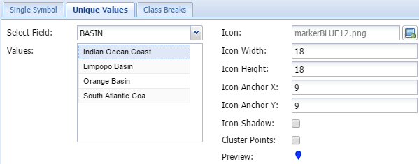
Select field
The user need to select a field in the attribute table where the unique values reside. Click on the dropdown box to choose.
Values:
The list of unique values will be displayed in the list box after the field was selected.
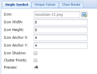
Icon
This is the icon to be displayed on the map. This will normally be the same as the Icon in the menu item. Choose an appropriate icon and upload it to the server. To assist users, MapAble has a set of icons which can be used by all users. Please go to the MapAble website and download it.
Icon width and height:
This get automatically filled in when the icon is uploaded. The user can however change the size to make it smaller. It is not ideal to make it larger because the icon image will pixelate and result in a poor map.
Icon anchors X & Y:
This is the position where the icon will anchor relative to the centre of the spatial point. This is normally set to be the centre of the image, but can be changed if necessary. The centre position is normally the middle of the width and height number
Icon shadow:
A shadow can be set for each icon by ticking the tickbox.
Cluster points:
If a point layer causes a map to be too busy. they can be displayed as cluster points instead. Cluster point shows a group of spatially clustering points as a single point with a colour code.
Preview:
This shows how the icon will be displayed on the map.
|